Data visualization is not just about creating pretty charts and graphs. It is about telling a story with data. By presenting data in a clear and concise manner, data visualization can help us identify patterns and trends that might not be immediately apparent when looking at raw data. This can lead to better decision-making and more informed choices.
The Role of Data Visualization in Decision Making
Data visualization plays an integral role in the decision-making process, as it helps stakeholders understand trends, patterns, relationships, and outliers within data. By presenting data in an easily digestible format, decision-makers can grasp the implications of the information, leading to more informed choices and better outcomes.
Furthermore, effective data visualization can foster collaboration and facilitate communication between team members by presenting information in a universally understandable manner.
For example, a sales team might use a data visualization tool to track their progress toward their monthly targets. By presenting this information in a clear and concise manner, the team can identify areas where they need to improve and take action accordingly. This can lead to increased sales, higher revenue, and better overall performance.
Benefits of Effective Data Visualization
Effective data visualization offers several benefits, such as:
- Improved comprehension of complex data
- Increased ability to identify trends and patterns
- Enhanced decision-making and problem-solving capabilities
- Streamlined communication, collaboration, and sharing of insights
- Reduced time, effort, and resources required to interpret data
These benefits are particularly important in today’s fast-paced business environment, where decisions need to be made quickly and accurately.
Common Challenges in Presenting Data Visually
Despite its benefits, presenting data visually poses some challenges. These may include difficulty in selecting the appropriate visualization, ensuring data accuracy and consistency, and striking a balance between simplicity and complexity. Furthermore, designers must carefully consider the use of color and design elements to optimize the visual appeal and efficacy of their visualizations.
One common challenge in data visualization is selecting the appropriate type of chart or graph to use. Different types of data require different types of visualizations, and choosing the wrong one can lead to confusion and misinterpretation. Another challenge is ensuring that the data is accurate and consistent. This is particularly important when dealing with large data sets, as even small errors can have a significant impact on the results.
Despite these challenges, effective data visualization is a powerful tool that can help us make sense of complex data and make better decisions. By understanding the importance of data visualization and the benefits it offers, we can leverage this tool to drive better outcomes and improve our overall performance.
Key Principles of Data Visualization
To overcome these challenges and create effective visualizations, it is crucial to adhere to the following key principles:
Choosing the Right Visualization Type
Selecting the most suitable visualization type for your data is essential in accurately conveying your message. Common types include bar charts, pie charts, line charts, and graphs. Each type has its own strengths and weaknesses and is best suited for specific types of data. The decision should be primarily driven by the insights you want your audience to extract from the data and the complexity of the data set.
Ensuring Data Accuracy and Consistency
Maintaining data accuracy is crucial for the credibility and effectiveness of your visualizations. Inaccurate data can lead to incorrect conclusions and poor decision-making. Consistency in design, formatting, and labeling across multiple visualizations is also essential to avoid confusion and misinterpretation.
Balancing Simplicity and Complexity
Striking the right balance between simplicity and complexity is vital for effective data visualization. A successful visualization should be simple and intuitive enough for the audience to grasp the key insights quickly, yet sufficiently detailed to accurately represent the data. Avoid unnecessary decorations and prioritize clarity and functionality.
Utilizing Color and Design Effectively
Color and design elements can greatly influence the effectiveness of your data visualization. Use color to highlight important trends and patterns, while ensuring consistency in color coding. Limiting the use of multiple colors can help prevent visual overload and focus attention on the most critical elements of your data. Additionally, consider responsive design techniques to optimize your visualizations for different screen sizes and devices.
Popular Data Visualization Tools and Techniques
Various data visualization tools and techniques are available to cater to a wide range of preferences, expertise levels, and data complexities. The key is to choose the most relevant tool or technique for your specific needs and requirements.
Microsoft Excel and Google Sheets
Microsoft Excel and Google Sheets are widely-used spreadsheet tools that contain built-in data visualization features such as charts and graphs. They are ideal for users who need to create quick, simple, and functional visualizations without investing in specialized software.
Tableau and Power BI
Tableau and Power BI are powerful, business intelligence tools designed specifically for creating interactive and visually appealing data visualizations. They are suitable for more complex data sets and allow for greater customization than spreadsheet tools.
D3.js and Other JavaScript Libraries
D3.js is a popular open-source JavaScript library that enables the creation of dynamic, interactive, and highly customizable visualizations for web presentations. Other JavaScript libraries such as Chart.js, Highcharts, and Plotly.js also offer powerful capabilities for data visualization in web applications.
Python Libraries for Data Visualization
For those proficient in Python, various libraries such as Matplotlib, Seaborn, and Plotly can be used to generate a wide range of visualizations, ranging from basic charts to complex interactive plots.
Best Practices for Data Visualization in Decision Making
To maximize the impact and utility of data visualizations in the decision-making process, follow these best practices:
Tailoring Visualizations to Your Audience
Consider the needs, preferences, and expertise of your audience when designing your visualizations. Create visualizations that are easily understood by your target audience and present the most relevant information in an accessible manner.
Incorporating Interactivity and Real-Time Data
Interactive visualizations can engage users, encourage exploration, and help them gain a deeper understanding of the data. Consider integrating real-time data sources to provide the most current and accurate information for decision-making.
Ensuring Accessibility and Inclusivity
Adopt accessibility best practices such as high-contrast color schemes, descriptive text labels, and alternative texts to cater to users with different abilities and ensure that your visualizations are inclusive to all.
Continuously Evaluating and Improving Visualizations
Regularly seek feedback from your audience, analyze usage data, and remain abreast of industry developments to continuously refine and improve your visualizations. This iterative approach will help ensure the ongoing efficacy and relevance of your data visualizations in decision-making.
In conclusion, data visualization is not only a persuasive tool that enables better decision-making but also a versatile skill with a wide range of applications.
By adhering to best practices and utilizing the right tools and techniques, you can harness the full potential of data visualization and make more informed decisions in your organization.
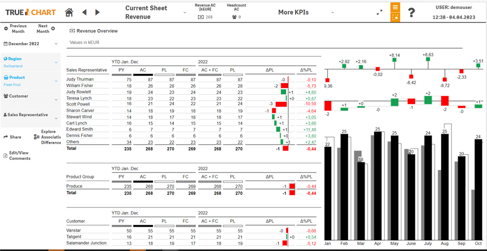
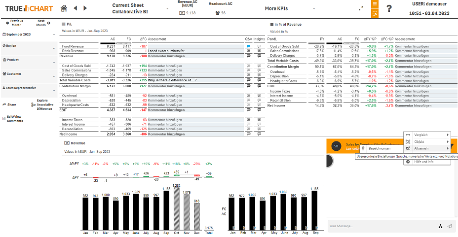
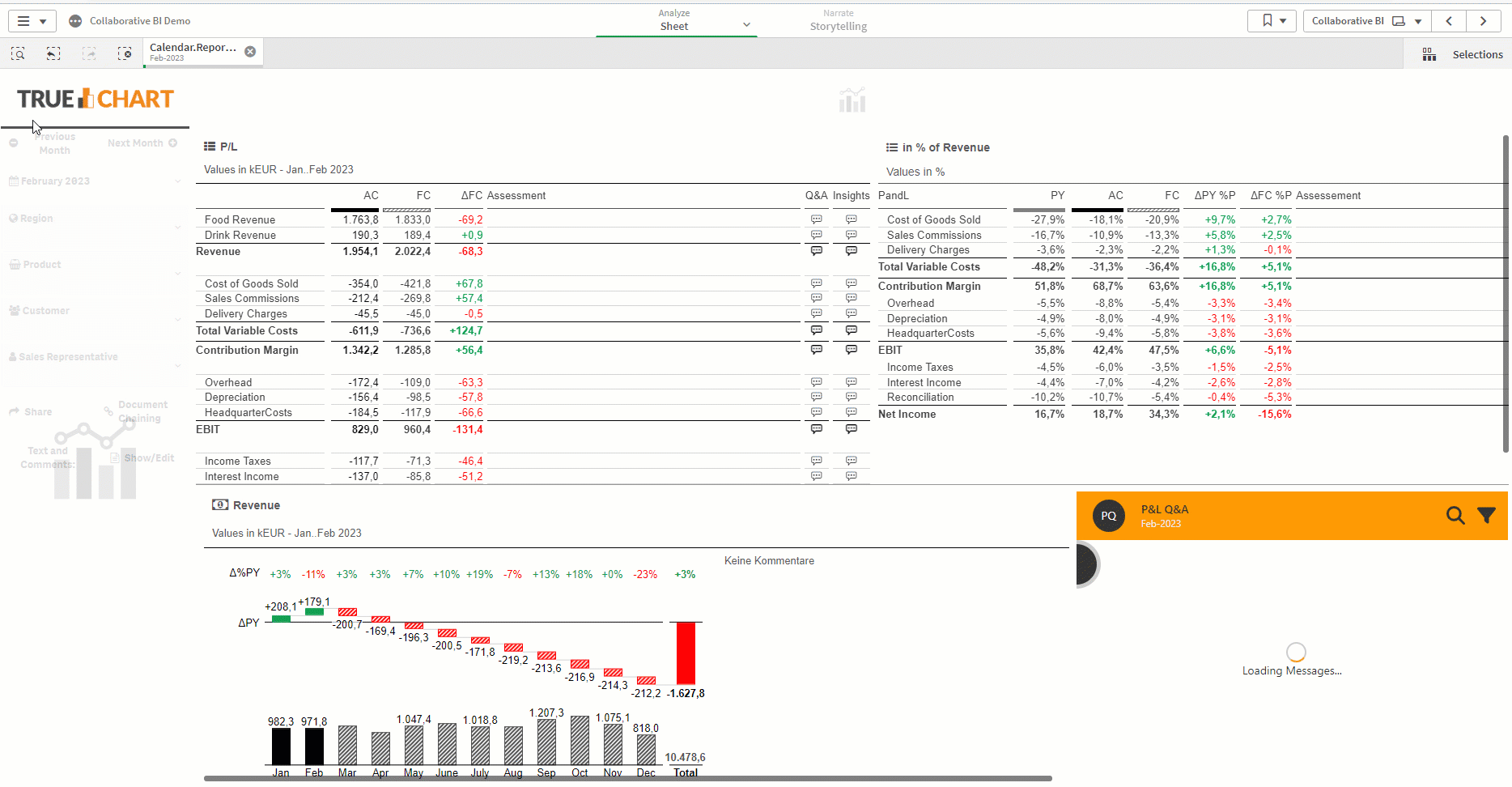
TRUECHART fundamentally changes data visualization and collaboration – powered by standardized IBCS® templates. It provides the speed and scale needed to tackle petabytes of business intelligence in interactive speed to make data management and complex reporting much easier, simpler, and faster. Book your TRUECHART demo today.
Stay up-to-date with TRUECHART. Follow us on LinkedIn.