We all know the adage, “A picture is worth a thousand words.”
But, what about data? Everybody knows that data is invaluable when it comes to running a business and making well-informed decisions. However, data is often presented in the form of raw numbers that fail to attract the attention of the audience; or perhaps even make sense.
Luckily, there is a way to combine the power of imagery with the value of data, thanks to data visualization. We like to refer to it as ‘visual analytics’.
The ABCs of Visual Analytics
Data visualization can easily bring plain numbers to life and become the master storyteller of the insights hidden to the “normal” eye. With the help of charts, graphs, interactive reports, and live dashboards, data visualization allows users to develop powerful business insights quickly and effectively.
Here is a brief three-step guide that will help make your data reports visually appealing:
1. Define the Purpose
When visualizing your data, the first step is to define its purpose. The easiest way to do this is by asking yourself, “How will the visualization help the reader/audience?”
Having a clear answer to this question helps avoid a common problem in data visualization – comparing “apples” to “oranges.” Plotting several sorts of data in the same chart is rarely a good idea since a reader may be misled into comparing variables that are not comparable. Make sure that your visualized reports stay clear and straightforward so that they don’t confuse the reader.
2. Start with Basic Visualization
Once you identify the purpose of your report, start working on a basic diagram. You can choose anything from a line chart, bar chart, flow chart, or even a map or scatterplot. Even though you might be tempted to use different chart types interchangeably, it is not the best practice unless you’re trying to show different kinds of information.
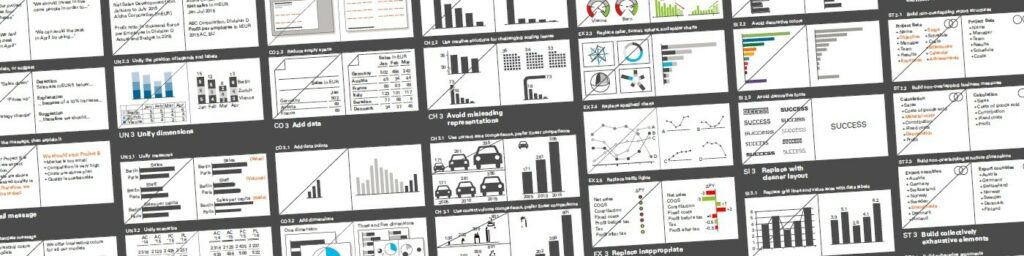
Following the SUCCESS rules of IBCS might help you do that.
3. Direct Attention to Key Messages
An essential step in data visualization is to identify the main points you want your audience to understand. And then, you need to find a way to attract attention to those points. Luckily, this can be done easily with the help of colors, shapes, labels, and even the size of the charts or any other elements. By doing so, you will ensure that your audience properly understands the main points of your report.
Data visualization is becoming an increasingly significant component of business intelligence. According to a TDWI survey, 74 percent of respondents attribute a “very high” or “high” gain in business user insights due to data visualization. Business customers of all levels got to answer their queries by interacting with quick, simple visual analytics dashboards.
Are you tired of seeing plain data reports filled with numbers only? Would you like to take your company’s data reports to the next level? We’re here to help. TRUECHART fundamentally changes data collaboration and how data is accessed, managed, modeled, and analyzed – powered by IBCS®.
Stay up-to-date with TRUECHART. Follow us on LinkedIn.