Data visualization refers to displaying data in a graphical form. Visualization provides an easy way to understand and analyze data for better decision-making.
Visualization has been around for some time but has recently become more prevalent due to technological advances that allow it to be done quickly and on large scales.
In this article, we explore the benefits of using data visualization for better decision-making.
Importance of Data Visualization for Companies
Data visualization ensures quick and efficient analysis of data. It assists employees in making more informed decisions by offering easy-to-understand visual representations of data.
Data presented in a visual format is easier to interpret and allows people to gain insights more rapidly. Visualizations might also help you express your findings more effectively. Visualized data also helps you see how independent variables are related to one another. For example, you can spot trends, understand the frequency of events, and observe the links between operations and performance.
Let’s dive deeper into some of the best uses of data visualization when it comes to business decision-making.

4 Ways Data Visualization Enhances Decision Making
To make informed decisions, you need accurate data. Data visualization can help you get more of the right data and derive valuable insights from it. For example:
Improved Speed and Efficiency
Data visualization saves time by summarizing a large amount of information into an easy-to-understand format that can be understood within seconds. Data analytics can also be done in real-time with a graphical element. This allows you to monitor the performance of your business at all times and take necessary action right away.
Even more so, it helps you see all of your data at once in a way you understand, also in real time.
Greater Accuracy
Data visualization may be objective and easy to understand, which results in increased accuracy. However, it’s important that you use the right visualization type for your data to be able to draw correct conclusions from the analysis. For example, pie charts are not great at showing numerical data with many categories because they imply equal value among slices even if that isn’t the case.
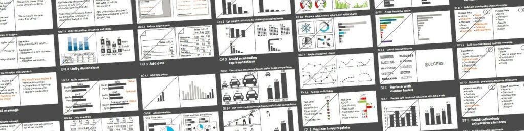
Our suggestion for visualization? Standards. The IBCS – International Business Communication Standards. Just as music composers all use the same layout and structure to make their compositions understood around the world, so do communication or notation standards in your reports.
If you ask us, IBCS does the best job at it.
Simplified Communication
Easy-to-understand reports also impact how you share information with other people in your company. For example, you might use a flowchart or bubble chart to show different stages of a process or how certain operations are linked to overall performance.
Visualization can thus prove to be an important tool for effective internal communication.
In turn, this fosters a great level of collaboration across your team and across departments which previously may have never even communicated.
Empowered Collaboration
Better data collaboration within your team allows everyone in your company to see the complete picture and make informed decisions based on this information rather than having a limited view of the data.
Improve collaboration, communication, and decision-making in your company simply by visually representing the data your company is dealing with. And, TRUECHART will teach you how!
With TRUECHART, your team will always be able to create quality visual reports and extract meaningful insights from them. TRUECHART makes pertinent information readily available, understandable, and actionable within your reporting platform. By utilizing modern design standards and data-dependent collaboration, business decisions become faster and better – powered by the IBCS standards for improved data visualization.
TRUECHART fundamentally changes data visualization and collaboration – powered by standardized IBCS® templates. It provides the speed and scale needed to tackle petabytes of business intelligence in interactive speed to make data management and complex reporting much easier, simpler, and faster.
Stay up-to-date with TRUECHART. Follow us on LinkedIn.