Data visualization design is both an art and a science, which is why it can be challenging to master. But, it is a crucial skill if you want to make an impact with the data you gather, analyze, and interpret.
Would you like to take data visualization in your company to the next level? We’ve compiled ten tips that will help you enhance your data visualizations and avoid the most common data design mistakes.
Improve Your Data Visualization with These 10 Tips
1. Less is more.
Keep your data visualizations simple and easy to interpret to make it easier for the audience to understand the main point.
2. Aesthetically pleasing design doesn’t mean an effective report.
When focusing on the design, you risk drawing the audience’s attention away from the most important thing in your visualization — the data. Instead, design for comprehension.
3. Ensure visual consistency.
You want your audience to be able to compare things at a glance. Make sure not to overwhelm the audience by comparing too many things. Also, pay attention to the placement – if your charts or graphs are placed too far apart, the audience might not “get” the comparison.
4. Don’t overdo it with the text.
If your report already mentions a fact, your subhead and chart header don’t have to repeat it, as well. Also, keep any descriptive text above the chart brief and directly related to the chart underneath for a clean visual design.
5. Don’t use cool fonts or elements to emphasize something.
If you need to emphasize a certain point, use bold or italic text. And, don’t use them at the same time.
6. Be careful with multiple colors.
If you want to include colors to depict data, use a single color to represent the same type of data. But, if you are, for example, comparing last year’s sales to this year’s sales in a grouped chart, you should use a different color for each year.
7. Pay attention to color associations.
Don’t use red for positive numbers or green for negative numbers. Those color associations are strong, and they are very likely to flip the meaning in the viewer’s mind automatically.
8. Check to see if labels are visible.
All labels should be unobstructed and immediately distinguishable from the data point they correspond to.
9. Label the lines directly.
Include data labels with your data points if at all possible. This allows readers to immediately recognize lines and labels without looking for a legend or equivalent point.
10. Order consistently and evenly.
The arrangement of the elements in your legend should correspond to the order of the objects in your chart. Also, try to use natural increments on your axes (0, 5, 10, 15, 20) instead of awkward or uneven increments (0, 3, 5, 16, 50).
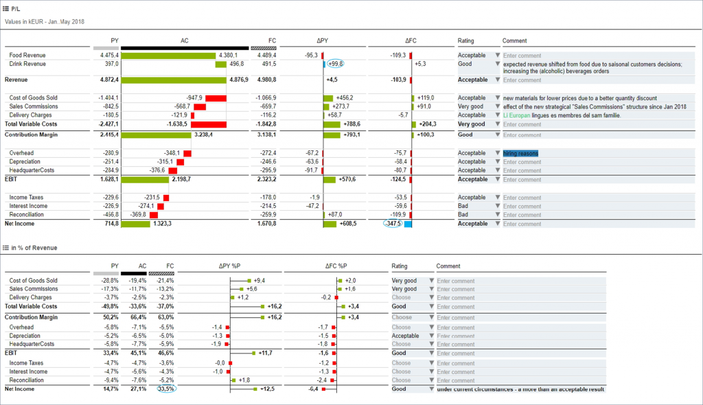
Did you know that 65% of bad business decisions stem from incorrect or misinterpreted data? Don’t let your company reports mislead you! Secure decision-making thanks to communication standards that can be implemented in all reports. Our recommendation? The International Business Communication Standards!
IBCS is based on standards that make every report understandable at a glance. By standard, we refer to a unified language, graph, and presentation that makes business communication as clear as a green traffic light. You can see what the report is all about at a glance.
For more data viz magic, check out TRUECHART. Our solution supports best-in-class visualization, data-driven communication, and platform independence. With the help of standardized IBCS® templates, TRUECHART makes complex reporting much easier, simpler, and faster.
Stay up-to-date with TRUECHART. Follow us on LinkedIn.