Data visualization is undoubtedly helpful. Thanks to data visualization, users of all levels can manipulate the visual analytics dashboards fast and easily. In other words, all employees can create meaningful and easy-to-understand reports and find the information they need when they need it.
However, data visualization comes with a few drawbacks that can, luckily, be fixed easily.
Oversimplification of Data
Perhaps one of the most significant benefits of using data visualization is being able to translate complicated information into more understandable terms.
However, it is very easy to go overboard and reduce hundreds of data points into a few charts or other pictorial representations. As a result, the message that the data was supposed to transmit might be completely misunderstood.
Lack of Skills of the Staff Preparing Visual Reports
As we already mentioned, the beauty of data visualization lies in the fact that almost everyone with a computer and a dataset can produce a well-designed and meaningful report. However, this is not necessarily true.
Not only does it take time and practice to develop the skills needed to create quality visual reports, but it is also essential to understand the data that is being presented.
In this same breath, the staff must be equipped with the knowledge required to create and understand meaningful reports – as basic as those requirements sometimes might be.
Lack of Understanding of Data
To create a meaningful visual report, it is necessary to fully understand the data but also the organization and its structure. After all, it doesn’t make much sense to search for relationships between data variables if the person creating the report isn’t aware of a recent reorganization or significant departments changes.
In other words, it is not only about understanding the software used to create the report, but the report itself and everything the data represents.
Overreliance on Visuals
Visual reports are meant to represent data in a more understandable manner. However, users can be tempted to start relying on visuals too much to interpret data, mostly because they can use them at a glance.
For example, a user may take the conclusion shown in a visual report as absolute truth and never explore the data sets behind the visuals.
As a result, the general conclusions drawn from data visualization might be applicable, but they won’t reveal all the information found in data sets.
How to Resolve Issues Related to Data Visualization?
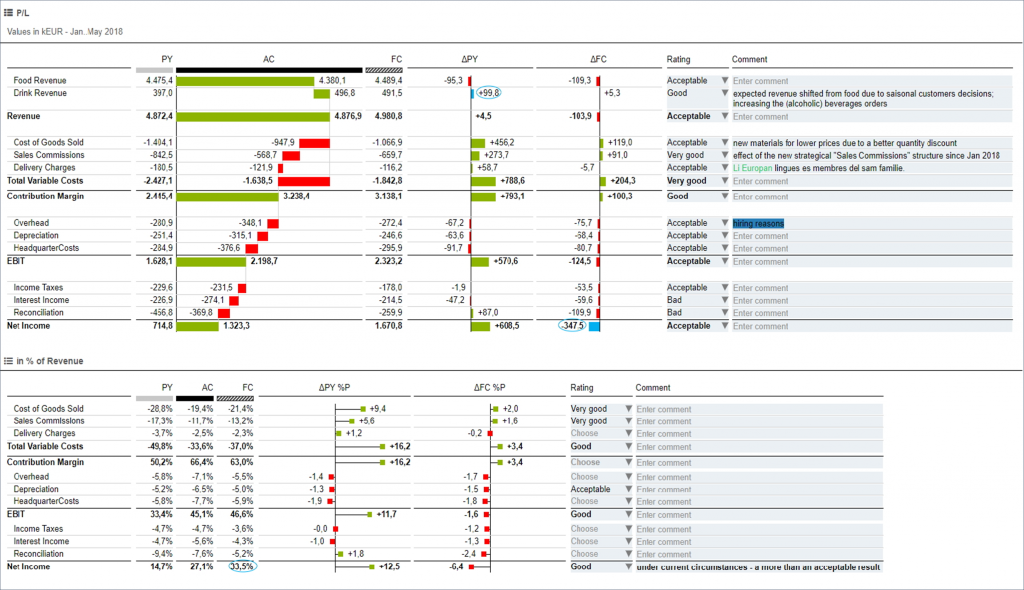
Avoiding the potential pitfalls of data visualization is easy if you’re equipped with the right tools. Solutions such as TRUECHART can make performance analysis a breeze in your company.
Collaboration and insights across departments are quick and easy. It’s days vs. clicks – TRUECHART fundamentally changes business analysis and the way business intelligence is accessed, managed, modeled, and analyzed.
In addition, the software’s visual design studio enables users at all levels — from business analysts to data scientists — to analyze, visualize, and extract information and deep, meaningful insights, even if they have no previous programming knowledge.
With TRUECHART, you will never have to worry about your data being oversimplified or misunderstood and your team being unable to create quality visual reports and extract meaningful insights from them.
Our solution supports best-in-class visualization, data-driven communication, and platform independence. With the help of standardized IBCS® templates, TRUECHART makes complex reporting much easier, simpler, and faster.
Stay up-to-date with TRUECHART. Follow us on LinkedIn.