Data reports can be very tricky. First of all, creating a proper data report requires effort and understanding of the reporting how-tos. Moreover, in addition to simply gathering and presenting the data, it is necessary for all the information demonstrated to make an impact. For that to happen, a data report needs to display one important characteristic – explainability.
Let’s consider the following example.
Many people were confident that Hillary Clinton was going to win the presidential election. However, these assumptions were based on polling data reports, not data analysis.
Understanding the difference between data reporting and data analysis can help companies avoid similar data errors. Data reporting, such as the poll data used in elections, can inform you what’s going on in your business.
However, without context or understanding why something is happening, your interpretation won’t be based on all the facts. In other words, reporting uses data to track the performance of a business while analysis uses data to answer strategic questions about the company.
Here are a few tips on how to make your data reports easier to understand.
How to Make Your Data Reports Easier to Understand?
1. Use data visualization.
If you present data in plain text form, your reader/audience will have difficulty understanding your real point. Good data storytelling combines copy and data visualization to transform the way people consume your data.
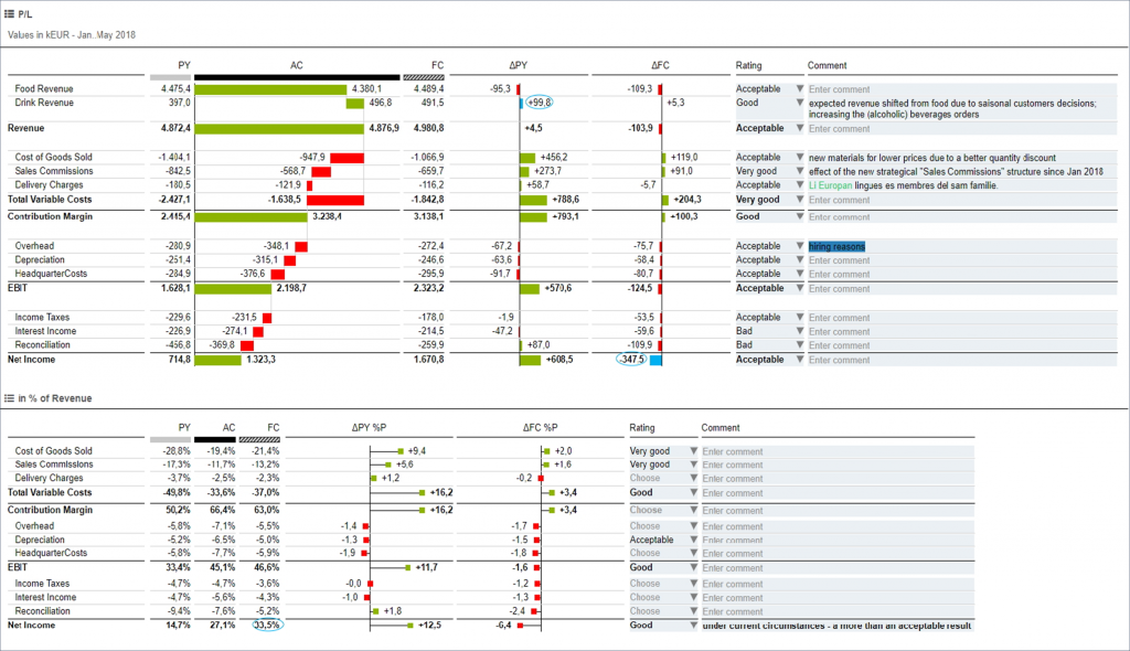
Our recommendation? IBCS® – every single time.
Data visualization is compelling because it targets the brain’s visual processing centers, allowing your audience to process what they are seeing instantly. When presenting your data visually, it’s not about just creating a chart or a graph. It’s about representing your data with the right chart to maximize comprehension.
2. Create a story around the data.
Data is very powerful. It can show companies what strategies are working or not, help them uncover important trends, and even reveal surprising truths.
However, to be able to get the full picture, it is necessary to dig deep into the data, extract important insights, and create a story around that.
Turning data into a story (aka data storytelling) is valuable, as it helps connect with the reader, communicate important facts more efficiently, and make the report more memorable.
3. Push the data narrative.
When some people hear “data storytelling,” they assume it includes just adding a few stats into your copy. However, data storytelling follows a compelling narrative, guides readers through content, and helps them understand not just the data but what those insights mean.
To craft a narrative around the data, it is necessary to:
- Engage your reader with an attention-grabbing title and subtitles.
- Provide context for the data.
- Create a logical flow.
- Highlight remarkable findings/insights in the data.
Are you struggling with creating your data reports? TRUECHART can help you out.
Our solution supports best-in-class visualization, data-driven communication, and platform independence. With the help of standardized IBCS® templates, TRUECHART makes complex reporting much easier, simpler, and faster.
Stay up-to-date with TRUECHART. Follow us on LinkedIn.