Facts and figures play an incredibly significant role for many businesses. This goes tenfold when it comes to visualizing those figures. For context, CEOs and managers are not the ones who gather and analyze data. Instead, data is ‘presented’ to them – most often in the form of clunky tables, graphs, or charts.
It is why creating visually friendly reports that every decision-maker can understand and act on is vital for any ‘data-driven’ business. And here’s how to do just that!

How to Create Data Reports That Matter
Inaccurate reports can lead to misinformation and significantly impact the decision-making process. Data reporting analysts are responsible for processing data and making sure it is presented in a way that is straightforward and easy to understand. The best way to ensure that a report is understandable is to make it visually friendly.
1. Make a Good First Impression
Even though we’re taught not to judge a book by its cover, when people see a plain report filled with numbers that don’t make much sense on the very first page, they’re likely to feel repelled immediately.
To make a great first impression, it is necessary to design an attractive cover page. Also, titles and subheadings help set expectations, so it is necessary to indicate the value the audience will get from the report. Structure matters. And, it goes without saying, all data reports should include visuals that grab the reader’s eye but also provide value at the same time.
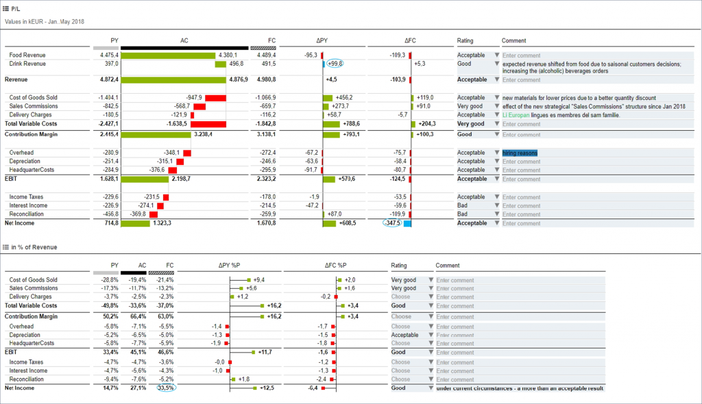
For us, the International Business Communication Standards (IBCS® for short) strike the perfect balance between actionable and easy-on-the-eyes when it comes to visualization.
2. Avoid Walls of Information
In general, people are less likely to read and focus on a report filled with intimidating, dull-looking walls of text, numbers, or other forms of visualization. Reports should integrate information in a way that helps decision-makers interpret everything more easily.
When creating a visually friendly report, it’s important to break up figures of primary focus from the rest of the report as well as to include other design elements to help make the report easy to read. It is also a good idea to accentuate important elements by color – we recommend not using more than 3-4 colors in total. Doing so will prevent having noticeable visual clutter.
3. Include Storytelling
As Miro Kazakoff, lecturer at MIT Sloan, says, the best way to get a person to make the right decisions with data is to “get in their head in a way they understand.” And, the best way to do so is with stories. The important thing about visualizing data in reports is to set the stage up for telling meaningful stories.
Storytelling allows data analysts to present datasets in a comprehensible, relatable, and, ultimately, actionable manner. To tell a story with data, analysts need to establish context, state the problem, explore probabilities, and arrive at a resolution. Adopting this approach will allow the analysts to walk their audience through all the important data, allowing them to act on it.
To do all of the above, the report has to be structured well, decluttered, and create in-sync with a presentation to shareholders that might be following after.
4. Standardized Format
Nothing say “wasted” more than re-doing the same thing in different ways, over and over again.
In larger companies, it is likely that more than one person will be making reports on any occasion, depending on how many teams exist and the size of those teams. To ensure that all reports have proper conceptual, perceptual, and semantic design of charts and tables, they need to be standardized. This will ensure that every report follows the same “visual” language, but also that everyone on the team knows what to expect, how to operate it, understand, and ultimately, how to act on it.
As we mentioned earlier, IBCS® is our clear choice for standards of ‘data-driven’ communication. With standardized reporting, businesses can easily increase the accuracy of their decisions by looking directly at the data within their dashboards and seeing “the story unfold.”
Are you looking to take your company’s data reports to the next level? We’re here to help. TRUECHART fundamentally changes data collaboration and how data is accessed, managed, modeled, and analyzed – powered by IBCS®.
Stay up-to-date with TRUECHART. Follow us on LinkedIn.